Reading time: 4 – 6 minutes

The Idea
Visualize your team’s code to get people enthused and more responsible for unit testing. See how commits contribute to or degrade testability. See massive, untested checkins from some developers, and encourage them to change their behavior for frequent, well tested commits.
Several years ago I worked with Miško Hevery, who came up with an unreleased prototype to visualize commits on a bubble chart. The prototype didn’t make it as an open source project, and Misko’s been so busy I don’t know what happened to it. I was talking to him recently, and we think there are lots of good ideas in it that other people may want to use. We’d like to share these ideas, in hopes it interests someone in the open source community.
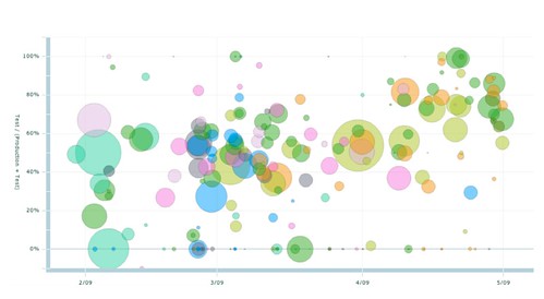
This is a standard Flex Bubble Chart. This was a rich flash widget with filtering, sorting, and other UI controls.
- Each bubble is a commit
- The X axis is a timeline
- The size of bubbles is the size of each checkin
- The colors of bubbles are unique per developer
- The Y axis represents the ratio of (test code / total code) changed in that checkin.
Size is measured in lines of code, an imperfect measure, but it proved useful for his internal use.
Interpreting It
We found that showing this to a few people generally got a big interest. All the developers wanted to see their bubbles. People would remember certain commits they have made, and relive or dispute with each other why certain ones had no test code committed.

Best of all, though, when used regularly, it can encourage better behavior, and expose bad behavior.

Using It
Developers often leave patterns. When reading code, I’ve often thought “Ahh, this code looks like so-and-so wrote it.” I look it up, and sure enough I’ve recognized their style. When you have many people checking in code, you often have subtly different styles. And some add technical debt to the overall codebase. This tool is a hard to dispute visual aid to encourage better style (developer testing).
Many retrospectives I lead start with a timeline onto which people place sticky notes of positive, negative, and puzzling events. This bubble chart can be projected on the wall, and milestones can be annotated. It is even more effective if you also annotating merges, refactorings, and when stories were completed.
If you add filtering per user story and/or cyclometric complexity, this can be a client friendly way to justifying to business people a big refactoring, why they need to pay down tech debt, or why a story was so costly.
While you must be careful with a tool like this, you can give it to managers for a mission control style view of what is going on. But beware of letting anyone fall into the trap of thinking people with more commits are doing more work. Frequent commits is probably a good sign, but with a tool like this, developers must continue to communicate so there are no misunderstandings or erroneous conclusions made by non-technical managers.
Some developers may claim a big code change with no test coverage was a refactoring, however even refactorings change tests in passing (Eclipse/Intellij takes care of the updates even if the developer is not applying scrutiny). Thus the real cause for the large commit with no tests deserves investigation.
Enhancements
Many other features existed in the real version, and a new implementation could add additional innovations to explore and communicate what is happening on your project.

- Filter by user
- Filter by size or ratio to highlight the most suspicious commits
- Filter by path in the commit tree
- Showing each bubble as a pie chart of different file types, and each of their respective tests.
- Display trend line per team or per area of code
- Use complexity or test coverage metrics instead of lines of code
- Add merge and refactoring commit visualizations
- Color coding commits to stories, and adding sorting and filters to identify stories with high suspected tech debt.
- Tie in bug fixes and trace them back to the original commits’ bubbles
We hope some of you also have created similar visualizations, or can add ideas to where you would use something like this. Thanks also to Paul Hammant for inspiration and suggestions in this article.